Global Port Spillover Estimator#
Data#
This analysis uses data from the IMF Portwatch Portal:
Spillover similulator-generated data for at-risk capacity (metric tons) dataset:Portwatch Spillover At-Risk Capacity Simulator Data.
Spillover simulator-generated data for at-risk-value (USD) dataset: Portwatch Spillover At-Risk Value Simulator Data
The Portwatch data draw upon a port-level geospatial layer describes the network of port-to-port connections given vessels movements between two respective ports. The network is based on a satellite-derived dataset of vessel movements of around 10,000 vessels between 2019 and 2020, from which a port-to-port transport network was constructed.
The spillover simulator estimates the amount of maritime capacity being at-risk of facing delays or disruptions due to port disruptions that affect outgoing vessel movements. These estimates are based on data as of November 12, 2023. The model assumes a linear relationship between the number of days of disruption and the impacts, measured in terms of lost metric tons (capacity) or USD (value)
Reference paper: Verschuur, J., Koks, E.E. & Hall, J.W. Systemic risks from climate-related disruptions at ports. Nat. Clim. Chang. 13, 804–806 (2023).
Methodology#
Import Libraries#
import pandas as pd
import matplotlib.pyplot as plt
Part I: Estimating At-Risk Capacity of a Port Disruption (Metric Tons) by Country#
Read in Downladed Dataset and Select Country of Interest#
# Read the data from the downloaded file into a DataFrame
df = pd.read_csv("data/2023-11-12-spill-data.csv")

# Filter data to only select rows where "to_country" = "Yemen" (for example)
df_filtered = df[df["to_country"] == "Yemen"]
Filter Data for Top Ten Impacted Countries (Summation of All Port Data for Each Country)#
# Identify the top ten "from_country" with greatest "daily_capacity_at_risk"
top_ten_countries = (
    df_filtered.groupby("from_country")["daily_capacity_at_risk"].sum().nlargest(10)
)

# Create a new table with 90-day indicator (using standard numbers in lieu of scientific notation)
new_table = top_ten_countries.reset_index()
new_table["daily_capacity_at_risk_90_days_disruption"] = (
    new_table["daily_capacity_at_risk"] * 90
).apply(lambda x: "{:.0f}".format(x))
Generate Bar Chart#
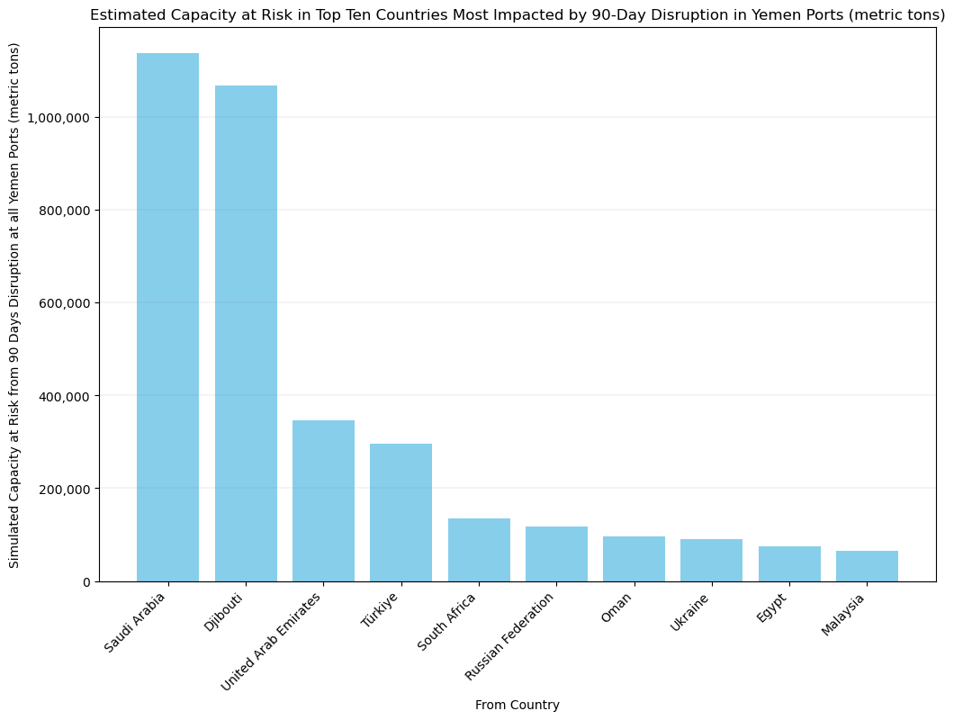
Aggregated by Country, Export Capacity at Risk during a 90-Day Disruption of Any Port in a Selected Country (Metric Tons)#
# Sort 'daily_capacity_at_risk_90_days_disruption' in descending order
sorted_table = new_table.copy()
sorted_table["daily_capacity_at_risk_90_days_disruption"] = sorted_table[
    "daily_capacity_at_risk_90_days_disruption"
].astype(int)
sorted_table = sorted_table.sort_values(
    by="daily_capacity_at_risk_90_days_disruption", ascending=False
)

# Create vertical bar chart with adjusted y-axis labels (without scientific notation)
plt.figure(figsize=(12, 8))
bars = plt.bar(
    sorted_table["from_country"],
    sorted_table["daily_capacity_at_risk_90_days_disruption"],
    color="skyblue",
)
plt.ylabel(
    "Simulated Capacity at Risk from 90 Days Disruption at all Yemen Ports (metric tons)"
)
plt.xlabel("From Country")
plt.title(
    "Estimated Capacity at Risk in Top Ten Countries Most Impacted by 90-Day Disruption in Yemen Ports (metric tons)"
)
plt.xticks(rotation=45, ha="right")

# Adjust y-axis labels to display standard numbers
plt.gca().get_yaxis().set_major_formatter(
    plt.FuncFormatter(lambda x, loc: "{:,}".format(int(x)))
)

# Add gray grid lines
plt.grid(axis="y", color="grey", linestyle="-", linewidth=0.25, alpha=0.5)

plt.savefig("images/capacity.png")
plt.show()


# Show accompanying table for clarity
sorted_table

| from_country | daily_capacity_at_risk | daily_capacity_at_risk_90_days_disruption | |
|---|---|---|---|
| 0 | Saudi Arabia | 12643.487558 | 1137914 |
| 1 | Djibouti | 11860.796300 | 1067472 |
| 2 | United Arab Emirates | 3855.990247 | 347039 |
| 3 | Türkiye | 3282.348785 | 295411 |
| 4 | South Africa | 1509.575073 | 135862 |
| 5 | Russian Federation | 1303.949299 | 117355 |
| 6 | Oman | 1076.202858 | 96858 |
| 7 | Ukraine | 998.247991 | 89842 |
| 8 | Egypt | 837.215334 | 75349 |
| 9 | Malaysia | 730.501202 | 65745 |
Part II: Estimating Aggregated At-Risk Export Value by Country from Any Port Disruption in a Selected Country (USD)#
Read in Downladed Dataset and Select Country of Interest#
# Read the data from the downloaded file into a DataFrame
data_df = pd.read_csv("data/2023-11-12-spill-country-data.csv")

# Filter data to only select rows where "to_country" = "Yemen" (for example)
country_data = data_df[data_df["to_country"] == "Yemen"]
Filter Data for Top Ten Impacted Countries (Summation of All Ports Data for Each Country)#
# First, filter the DataFrame to include only the rows where 'industry' == 'Total'
total_industry_data = country_data[country_data["industry"] == "Total"]

# Group and aggregate on the filtered DataFrame
grouped_data = (
    total_industry_data.groupby(["from_country"])
    .agg(
        daily_export_value_at_risk=("daily_export_value_at_risk", "sum"),
        daily_import_value_at_risk=("daily_import_value_at_risk", "sum"),
    )
    .reset_index()
)

# Identify the top ten countries with the greatest daily_export_value_at_risk
top_ten_exporters = grouped_data.nlargest(10, "daily_export_value_at_risk")

# Create a new table for these top ten countries, including a new column that multiplies the export value by 90 days (or other time period -- the relationship is linear)
top_ten_exporters["at_risk_daily_export_value_90x"] = (
    top_ten_exporters["daily_export_value_at_risk"] * 90
)
Generate Bar Chart#
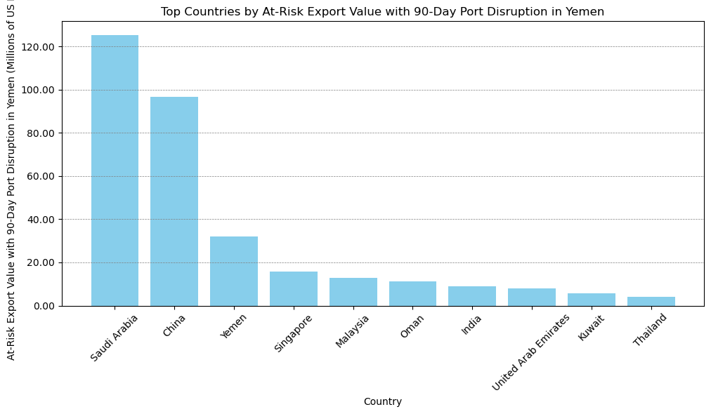
Aggregated by Country, Export Value at Risk during a 90-Day Disruption of Any Port in a Selected Country (USD)#
# Create bar chart with y-axis showing "millions" and gray grid lines
plt.figure(figsize=(10, 6))
plt.bar(
    top_ten_exporters["from_country"],
    top_ten_exporters["at_risk_daily_export_value_90x"] / 1e6,
    color="skyblue",
)
plt.title("Top Countries by At-Risk Export Value with 90-Day Port Disruption in Yemen")
plt.xlabel("Country")
plt.ylabel(
    "At-Risk Export Value with 90-Day Port Disruption in Yemen (Millions of US Dollars"
)
plt.xticks(rotation=45)
plt.grid(axis="y", color="gray", linestyle="--", linewidth=0.5)
plt.tight_layout()

# Adjust the y-axis labels to reflect the new scale in millions
plt.gca().get_yaxis().set_major_formatter(
    plt.FuncFormatter(lambda x, loc: "{:.2f}".format(x))
)

# Display the adjusted plot
plt.savefig("images/value.png")
plt.show()

# Show the new table for top ten countries
top_ten_exporters

| from_country | daily_export_value_at_risk | daily_import_value_at_risk | at_risk_daily_export_value_90x | |
|---|---|---|---|---|
| 73 | Saudi Arabia | 1.392650e+06 | 1.382254e+07 | 1.253385e+08 |
| 13 | China | 1.073514e+06 | 6.136940e+06 | 9.661629e+07 |
| 100 | Yemen | 3.543018e+05 | 1.353540e+07 | 3.188716e+07 |
| 75 | Singapore | 1.765200e+05 | 4.802792e+06 | 1.588680e+07 |
| 52 | Malaysia | 1.427114e+05 | 1.464506e+06 | 1.284402e+07 |
| 62 | Oman | 1.243433e+05 | 1.370501e+06 | 1.119089e+07 |
| 34 | India | 9.906518e+04 | 1.832184e+06 | 8.915866e+06 |
| 94 | United Arab Emirates | 8.772177e+04 | 1.964594e+06 | 7.894959e+06 |
| 46 | Kuwait | 6.466021e+04 | 4.853408e+04 | 5.819419e+06 |
| 86 | Thailand | 4.703336e+04 | 5.448601e+05 | 4.233002e+06 |
Identify Top Ten Countries in Terms of Impacted Percentage of Total Exports by a Port Disruption#
# Calculate total export value for each country to all destinations
total_export_to_all_countries = (
    data_df[data_df["industry"] == "Total"]
    .groupby("from_country")["daily_export_value_at_risk"]
    .sum()
    .reset_index()
)
total_export_to_all_countries.rename(
    columns={"daily_export_value_at_risk": "total_export_value_to_all"}, inplace=True
)

# Merge this with the top_ten_exporters DataFrame
top_ten_exporters_with_total = pd.merge(
    top_ten_exporters, total_export_to_all_countries, on="from_country", how="left"
)

# Calculate percent of total export value to selected country out of total export value to all countries
top_ten_exporters_with_total["portion_of_total_export_to_Country"] = (
    top_ten_exporters_with_total["daily_export_value_at_risk"]
    / top_ten_exporters_with_total["total_export_value_to_all"]
)

# Sort the DataFrame by 'portion_of_total_export_to_Country' in descending order
sorted_by_portion_to_yemen = top_ten_exporters_with_total.sort_values(
    by="portion_of_total_export_to_Country", ascending=False
)

# Select the top ten countries based on the largest 'portion_of_total_export_to_Country'
top_ten_countries_by_portion_to_country = sorted_by_portion_to_yemen.head(10)

# Now, 'top_ten_countries_by_portion_to_yemen' contains the top ten countries in terms of portion of total export to Yemen.
top_ten_countries_by_portion_to_country
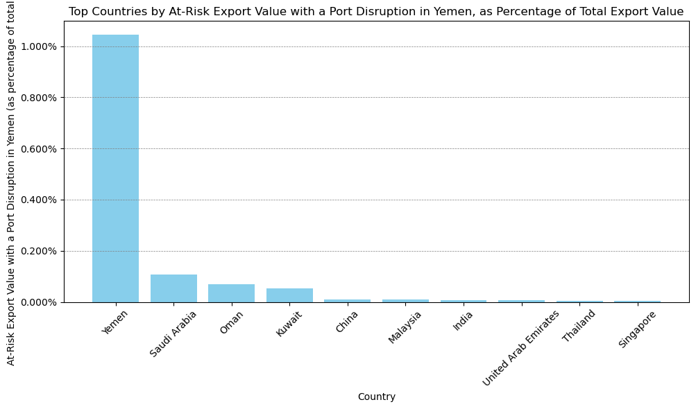
| from_country | daily_export_value_at_risk | daily_import_value_at_risk | at_risk_daily_export_value_90x | total_export_value_to_all | portion_of_total_export_to_Country | |
|---|---|---|---|---|---|---|
| 2 | Yemen | 3.543018e+05 | 1.353540e+07 | 3.188716e+07 | 3.387392e+07 | 0.010459 |
| 0 | Saudi Arabia | 1.392650e+06 | 1.382254e+07 | 1.253385e+08 | 1.310762e+09 | 0.001062 |
| 5 | Oman | 1.243433e+05 | 1.370501e+06 | 1.119089e+07 | 1.819159e+08 | 0.000684 |
| 8 | Kuwait | 6.466021e+04 | 4.853408e+04 | 5.819419e+06 | 1.235327e+08 | 0.000523 |
| 1 | China | 1.073514e+06 | 6.136940e+06 | 9.661629e+07 | 9.855455e+09 | 0.000109 |
| 4 | Malaysia | 1.427114e+05 | 1.464506e+06 | 1.284402e+07 | 1.569800e+09 | 0.000091 |
| 6 | India | 9.906518e+04 | 1.832184e+06 | 8.915866e+06 | 1.380379e+09 | 0.000072 |
| 7 | United Arab Emirates | 8.772177e+04 | 1.964594e+06 | 7.894959e+06 | 1.328998e+09 | 0.000066 |
| 9 | Thailand | 4.703336e+04 | 5.448601e+05 | 4.233002e+06 | 8.547186e+08 | 0.000055 |
| 3 | Singapore | 1.765200e+05 | 4.802792e+06 | 1.588680e+07 | 4.315688e+09 | 0.000041 |
Generate Bar Chart#
Aggregated by Country, Export Value at Risk due to Disruption of Any Port in a Selected Country (Percent of Total Export Value)#
import matplotlib.pyplot as plt
from matplotlib.ticker import PercentFormatter

plt.figure(figsize=(10, 6))
plt.bar(
    top_ten_countries_by_portion_to_country["from_country"],
    top_ten_countries_by_portion_to_country["portion_of_total_export_to_Country"],
    color="skyblue",
)
plt.title(
    "Top Countries by At-Risk Export Value with a Port Disruption in Yemen, as Percentage of Total Export Value"
)
plt.xlabel("Country")
plt.ylabel(
    "At-Risk Export Value with a Port Disruption in Yemen (as percentage of total exports)"
)
plt.xticks(rotation=45)
plt.grid(axis="y", color="gray", linestyle="--", linewidth=0.5)
plt.tight_layout()

# Adjust the y-axis labels to reflect percentages with 3 decimal places
plt.gca().yaxis.set_major_formatter(PercentFormatter(1, 3))

# Display the adjusted plot
plt.savefig("images/value-percent.png")
plt.show()

