Tourism, Air Travel and Hotel Occupancy in Lebanon#
Data#
UNWTO: The UNWTO collects data for all the countries across the world. For Lebanon, its source is the Ministère du Tourisme. Complete details of their methodology can be found here
Global Aviation Dashboard: This is an initative of the World Bank. It visualizes aggregated data on commercial flight movements around the world. The dashboard is powered by a unique dataset that draws on information supplied by flightradar24, ch-aviation, and various other sources.
The underlying data used in this analysis can be accessed through Project SharePoint
Findings#
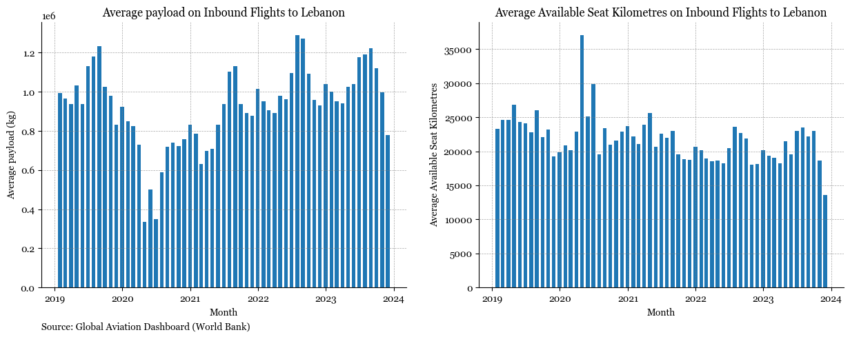
Analysing average Payload and Available Seat Kilometres on inbound flights#
Show code cell source
fig, axs = plt.subplots(1, 2, figsize=(15, 5))
plt.rcParams["font.family"] = "Georgia"
# inbound_tourism.plot(ax=ax, label = 'Inbound Tourism')
# inbound_tourism_by_air.plot(ax=ax)


axs[0].bar(
    x=inbound_flights_mena_monthly_ask["date"],
    height=inbound_flights_mena_monthly_ask["total_ask"],
    width=20,
)
axs[1].bar(
    x=inbound_flights_mena_monthly_ask["date"],
    height=inbound_flights_mena_monthly_ask["total_payload"],
    width=20,
)


# legend_without_title = ax.legend(title=None, loc='upper left', frameon=False)

for ax in axs:
    # Hide the right and top spines (axis lines)
    ax.spines["right"].set_visible(False)
    ax.spines["top"].set_visible(False)

    # Only show ticks on the left and bottom spines
    ax.yaxis.set_ticks_position("left")
    ax.xaxis.set_ticks_position("bottom")

    ax.grid(which="both", linestyle="--", linewidth=0.5, color="gray", alpha=0.7)

    axs[0].set_title(
        "Average payload on Inbound Flights to Lebanon", font="Georgia", fontsize=12
    )
    axs[1].set_title(
        "Average Available Seat Kilometres on Inbound Flights to Lebanon",
        font="Georgia",
        fontsize=12,
    )

    ax.set_xlabel("Month")
    axs[0].set_ylabel("Average payload (kg)")
    axs[1].set_ylabel("Average Available Seat Kilometres")

subtitle = "Source: Global Aviation Dashboard (World Bank)"
axs[0].text(
    0,
    -0.15,
    subtitle,
    ha="left",
    va="center",
    transform=axs[0].transAxes,
    fontsize=10,
    color="black",
    weight="normal",
);
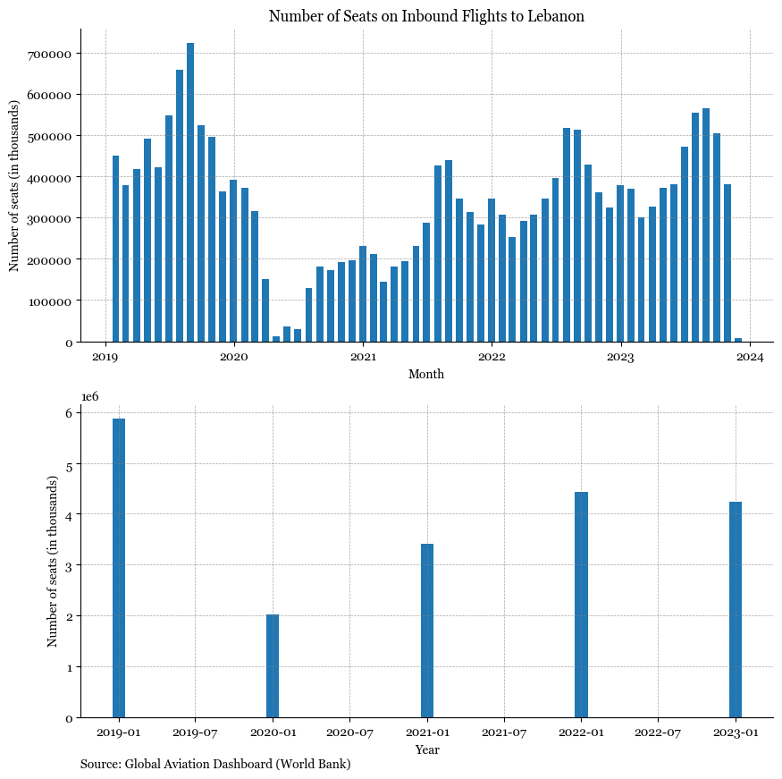
Analysing seats on inbound flights#
Show code cell source
fig, axs = plt.subplots(2, 1, figsize=(10, 10))
plt.rcParams["font.family"] = "Georgia"
# inbound_tourism.plot(ax=ax, label = 'Inbound Tourism')
# inbound_tourism_by_air.plot(ax=ax)


axs[0].bar(
    x=inbound_flights_mena_monthly_all["date"],
    height=inbound_flights_mena_monthly_all["total_seats"],
    width=20,
)
axs[1].bar(
    x=inbound_flights_mena_yearly_all["date"],
    height=inbound_flights_mena_yearly_all["total_seats"],
    width=30,
)


# legend_without_title = ax.legend(title=None, loc='upper left', frameon=False)

for ax in axs:
    # Hide the right and top spines (axis lines)
    ax.spines["right"].set_visible(False)
    ax.spines["top"].set_visible(False)

    # Only show ticks on the left and bottom spines
    ax.yaxis.set_ticks_position("left")
    ax.xaxis.set_ticks_position("bottom")

    ax.grid(which="both", linestyle="--", linewidth=0.5, color="gray", alpha=0.7)

    axs[0].set_title(
        "Number of Seats on Inbound Flights to Lebanon", font="Georgia", fontsize=12
    )
    axs[0].set_xlabel("Month")
    axs[1].set_xlabel("Year")
    ax.set_ylabel("Number of seats (in thousands)")

subtitle = "Source: Global Aviation Dashboard (World Bank)"
axs[1].text(
    0,
    -0.15,
    subtitle,
    ha="left",
    va="center",
    transform=axs[1].transAxes,
    fontsize=10,
    color="black",
    weight="normal",
);
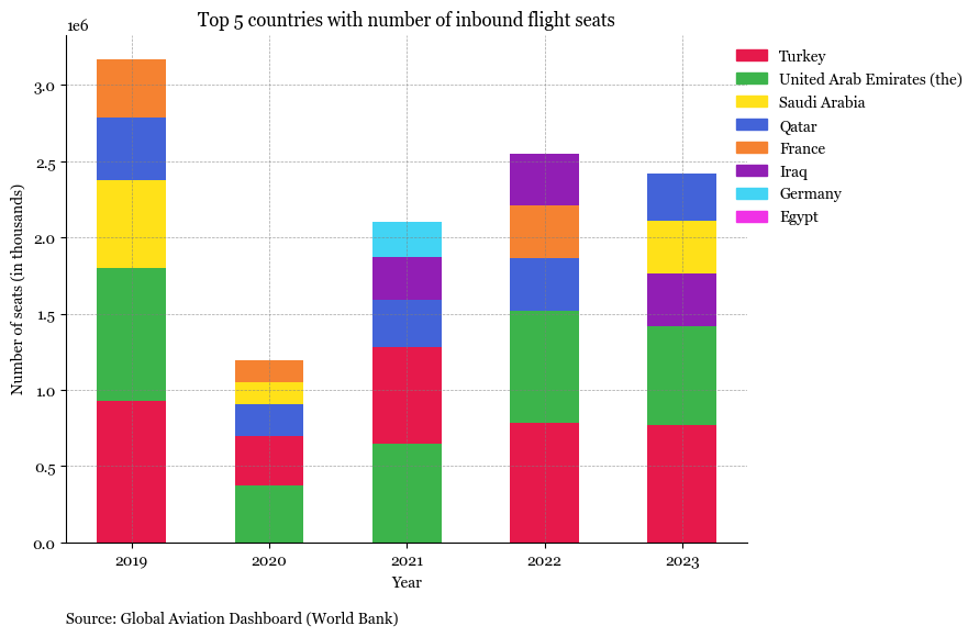
Show code cell source
import numpy as np
import matplotlib.patches as mpatches


df = top_categories_seats
sorted_df = df.sort_values(by=["date", "total_seats"], ascending=[True, False])

# Unique years and categories
years = sorted_df["date"].unique()


fig, ax = plt.subplots(figsize=(8, 6))
bar_width = 0.5
colors = [
    "#e6194b",
    "#3cb44b",
    "#ffe119",
    "#4363d8",
    "#f58231",
    "#911eb4",
    "#42d4f4",
    "#f032e6",
    "#bfef45",
    "#fabed4",
]
# Plotting each category
for i, year in enumerate(years):
    bottom = np.zeros(len(years))
    sorted_df = df[df["date"] == year].sort_values(by="total_seats", ascending=False)
    categories = sorted_df["origin_country"].unique()

    for j, category in enumerate(categories):
        value = sorted_df[
            (sorted_df["date"] == year) & (sorted_df["origin_country"] == category)
        ]["total_seats"].sum()
        if value > 0:
            ax.bar(
                year,
                value,
                bar_width,
                bottom=bottom[i],
                color=country_color_map[category],
                label=category if i == 0 else "",
            )
            bottom[i] += value


ax.set_xlabel("Year")
ax.set_ylabel("Number of seats (in thousands)")

legend_patches = [
    mpatches.Patch(color=color, label=country)
    for country, color in country_color_map.items()
]
ax.legend(
    handles=legend_patches, loc="upper center", frameon=False, bbox_to_anchor=(1.15, 1)
)

# Hide the right and top spines (axis lines)
ax.spines["right"].set_visible(False)
ax.spines["top"].set_visible(False)

# Only show ticks on the left and bottom spines
ax.yaxis.set_ticks_position("left")
ax.xaxis.set_ticks_position("bottom")

ax.grid(which="both", linestyle="--", linewidth=0.5, color="gray", alpha=0.7)

ax.set_title("Top 5 countries with number of inbound flight seats")
plt.xticks(rotation=0)

subtitle = "Source: Global Aviation Dashboard (World Bank)"
ax.text(
    0,
    -0.15,
    subtitle,
    ha="left",
    va="center",
    transform=ax.transAxes,
    fontsize=10,
    color="black",
    weight="normal",
);
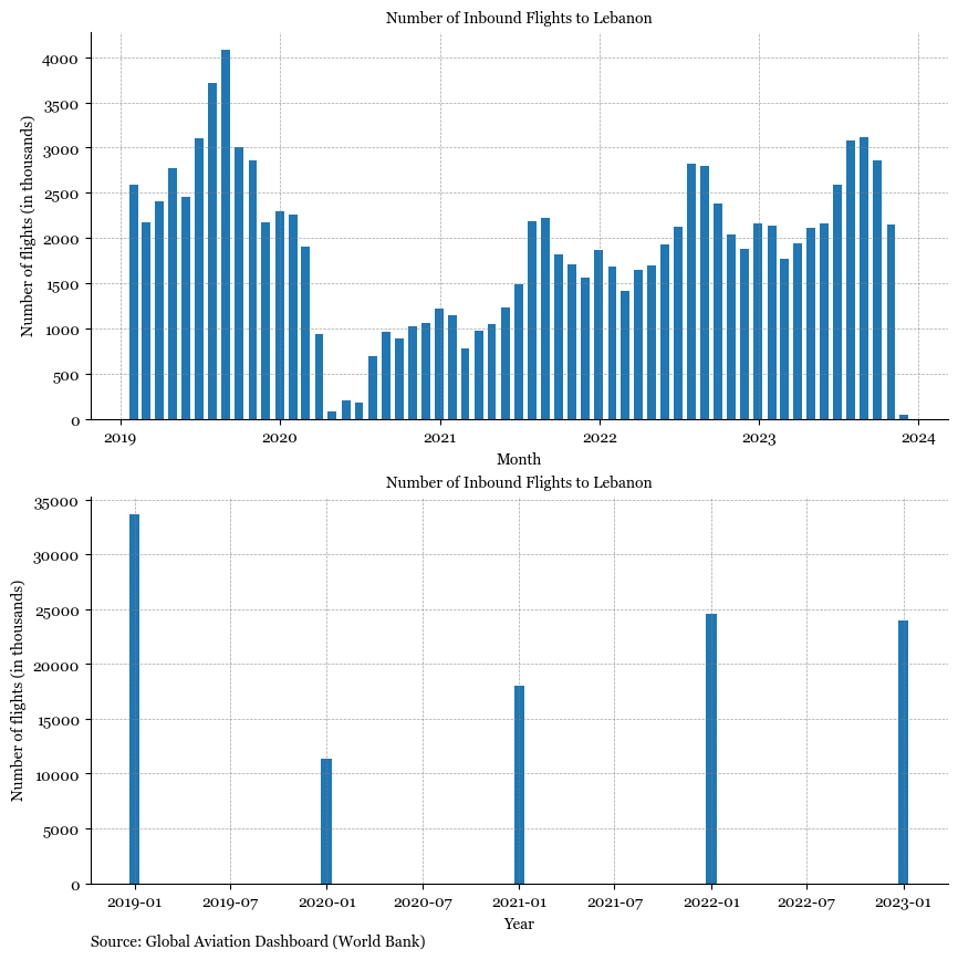
Analysing number of inbound flights#
Show code cell source
fig, axs = plt.subplots(2, 1, figsize=(10, 10))
plt.rcParams["font.family"] = "Georgia"
# inbound_tourism.plot(ax=ax, label = 'Inbound Tourism')
# inbound_tourism_by_air.plot(ax=ax)

axs[0].bar(
    x=inbound_flights_mena_monthly_all["date"],
    height=inbound_flights_mena_monthly_all["total_flights"],
    width=20,
)
axs[1].bar(
    x=inbound_flights_mena_yearly_all["date"],
    height=inbound_flights_mena_yearly_all["total_flights"],
    width=20,
)


# legend_without_title = ax.legend(title=None, loc='upper left', frameon=False)

for ax in axs:
    # Hide the right and top spines (axis lines)
    ax.spines["right"].set_visible(False)
    ax.spines["top"].set_visible(False)

    # Only show ticks on the left and bottom spines
    ax.yaxis.set_ticks_position("left")
    ax.xaxis.set_ticks_position("bottom")

    ax.grid(which="both", linestyle="--", linewidth=0.5, color="gray", alpha=0.7)

    ax.set_title("Number of Inbound Flights to Lebanon", font="Georgia")
    axs[0].set_xlabel("Month")
    axs[1].set_xlabel("Year")
    ax.set_ylabel("Number of flights (in thousands)")

subtitle = "Source: Global Aviation Dashboard (World Bank)"
axs[1].text(
    0,
    -0.15,
    subtitle,
    ha="left",
    va="center",
    transform=axs[1].transAxes,
    fontsize=10,
    color="black",
    weight="normal",
);
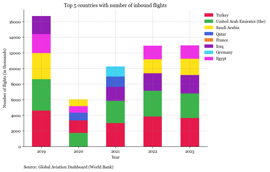
Show code cell source
import numpy as np

df = top_categories_flights
sorted_df = df.sort_values(by=["date", "total_flights"], ascending=[True, False])

# pivot_df = sorted_df.pivot_table(index='date', columns='origin_country', values='total_seats', fill_value=0)


# Unique years and categories
years = sorted_df["date"].unique()


# Preparing the plot
fig, ax = plt.subplots(figsize=(8, 6))
bar_width = 0.5
colors = [
    "#e6194b",
    "#3cb44b",
    "#ffe119",
    "#4363d8",
    "#f58231",
    "#911eb4",
    "#42d4f4",
    "#f032e6",
    "#bfef45",
    "#fabed4",
]
# Plotting each category
for i, year in enumerate(years):
    bottom = np.zeros(len(years))
    sorted_df = df[df["date"] == year].sort_values(by="total_flights", ascending=False)
    categories = sorted_df["origin_country"].unique()

    for j, category in enumerate(categories):
        value = sorted_df[
            (sorted_df["date"] == year) & (sorted_df["origin_country"] == category)
        ]["total_flights"].sum()
        if value > 0:
            ax.bar(
                year,
                value,
                bar_width,
                bottom=bottom[i],
                color=country_color_map[category],
                label=category if i == 0 else "",
            )
            bottom[i] += value

ax.set_xlabel("Year")
ax.set_ylabel("Number of flights (in thousands)")

legend_patches = [
    mpatches.Patch(color=color, label=country)
    for country, color in country_color_map.items()
]
ax.legend(
    handles=legend_patches, loc="upper center", frameon=False, bbox_to_anchor=(1.15, 1)
)

# Hide the right and top spines (axis lines)
ax.spines["right"].set_visible(False)
ax.spines["top"].set_visible(False)

# Only show ticks on the left and bottom spines
ax.yaxis.set_ticks_position("left")
ax.xaxis.set_ticks_position("bottom")

ax.grid(which="both", linestyle="--", linewidth=0.5, color="gray", alpha=0.7)

ax.set_title("Top 5 countries with number of inbound flights")
plt.xticks(rotation=0)
subtitle = "Source: Global Aviation Dashboard (World Bank)"
ax.text(
    0,
    -0.15,
    subtitle,
    ha="left",
    va="center",
    transform=ax.transAxes,
    fontsize=10,
    color="black",
    weight="normal",
);
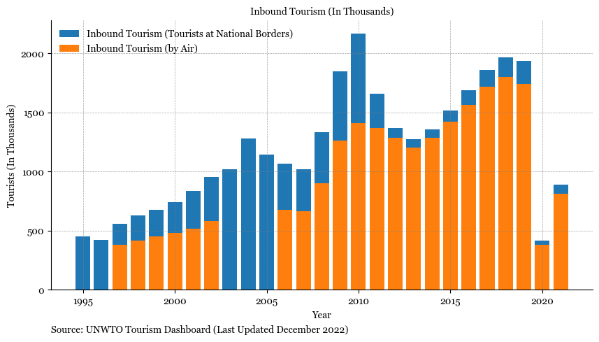
Analysin tourism data from UNWTO#
Show code cell source
fig, ax = plt.subplots(figsize=(10, 5))
plt.rcParams["font.family"] = "Georgia"
# inbound_tourism.plot(ax=ax, label = 'Inbound Tourism')
# inbound_tourism_by_air.plot(ax=ax)

ax.bar(
    x=inbound_tourism.index,
    height=inbound_tourism["Inbound Tourism (Total)"],
    label="Inbound Tourism (Tourists at National Borders)",
)
ax.bar(
    x=inbound_tourism_by_air.index,
    height=inbound_tourism_by_air["Inbound Tourism (by Air)"],
    label="Inbound Tourism (by Air)",
)

legend_without_title = ax.legend(title=None, loc="upper left", frameon=False)

# Hide the right and top spines (axis lines)
ax.spines["right"].set_visible(False)
ax.spines["top"].set_visible(False)

# Only show ticks on the left and bottom spines
ax.yaxis.set_ticks_position("left")
ax.xaxis.set_ticks_position("bottom")

ax.grid(which="both", linestyle="--", linewidth=0.5, color="gray", alpha=0.7)

ax.set_title("Inbound Tourism (In Thousands)", font="Georgia")
ax.set_xlabel("Year")
ax.set_ylabel("Tourists (In Thousands)")

subtitle = "Source: UNWTO Tourism Dashboard (Last Updated December 2022)"
ax.text(
    0,
    -0.15,
    subtitle,
    ha="left",
    va="center",
    transform=ax.transAxes,
    fontsize=10,
    color="black",
    weight="normal",
);
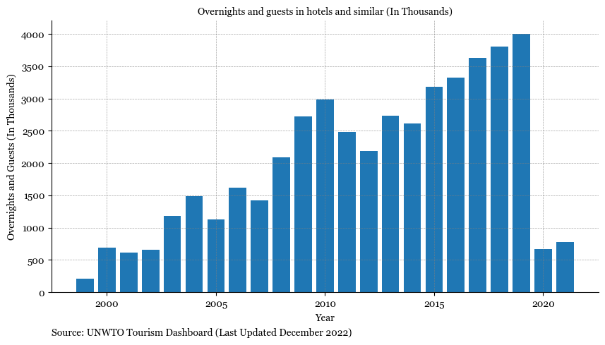
Hotel Occupancy#
Show code cell source
fig, ax = plt.subplots(figsize=(10, 5))
plt.rcParams["font.family"] = "Georgia"
# inbound_tourism.plot(ax=ax, label = 'Inbound Tourism')
# inbound_tourism_by_air.plot(ax=ax)

ax.bar(x=hotel_occupancy["Year"], height=hotel_occupancy["Total Accommodation"])

# legend_without_title = ax.legend(title=None, loc='upper left', frameon=False)

# Hide the right and top spines (axis lines)
ax.spines["right"].set_visible(False)
ax.spines["top"].set_visible(False)

# Only show ticks on the left and bottom spines
ax.yaxis.set_ticks_position("left")
ax.xaxis.set_ticks_position("bottom")

ax.grid(which="both", linestyle="--", linewidth=0.5, color="gray", alpha=0.7)

ax.set_title(
    "Overnights and guests in hotels and similar (In Thousands)", font="Georgia"
)
ax.set_xlabel("Year")
ax.set_ylabel("Overnights and Guests (In Thousands)")

subtitle = "Source: UNWTO Tourism Dashboard (Last Updated December 2022)"
ax.text(
    0,
    -0.15,
    subtitle,
    ha="left",
    va="center",
    transform=ax.transAxes,
    fontsize=10,
    color="black",
    weight="normal",
);