Visualizing Millions of Waze Traffic Alerts with BigQuery, H3 and Dask
by Gabriel Stefanini VicenteWaze Transport Urban Development
Waze for Cities, a Data Partner of the Development Data Partnership, connects government partners to high quality, frequent and granular traffic data extremely valuable in informing public sector, transport and urban planning as well as addressing the United Nations’s Sustainable Development Goals. Even so, sucessfully leveraging these alternative and often large data sources may pose challenges in building capacity adopting best available data, tools and practices.
In this first installlment of a Partnership series, we demonstrate how to analyze and visualize Waze for Cities data using Google BigQuery, H3 and Dask.
Waze for Cities
Waze has become an indispensable platform where over 140 million monthly drivers check and report accidents, slow downs, incidents and irregularities, adding up to billions of precious data points that could be better repurposed for improving public sector, transport and urban planning.

Since 2014, Waze has shared these data freely for government partners as part of the Waze for Cities program and providing a myriad of data and tools via Google Cloud. The available data feeds are Traffic Alerts, Traffic Accidents and Traffic Irregularities.
Next, in this example, we will explore and visualize millions of Waze Traffic Alerts.
Visualizing Waze Traffic Alerts
Waze Traffic Alerts include all traffic events and incidents reported by Waze users through the mobile application over a selected period of time, categorized into types, e.g. ACCIDENT or JAM, and subtypes, e.g. JAM_MODERATE_TRAFFIC, JAM_HEAVY_TRAFFIC, JAM_STAND_STILL_TRAFFIC or JAM_LIGHT_TRAFFIC. See documentation.
Waze makes its traffic data available through a historical archive on Google Cloud or a live GeoRSS feed that is updated every 2 minutes. For example, see below a live feed snapshot for Kiev, Ukraine.
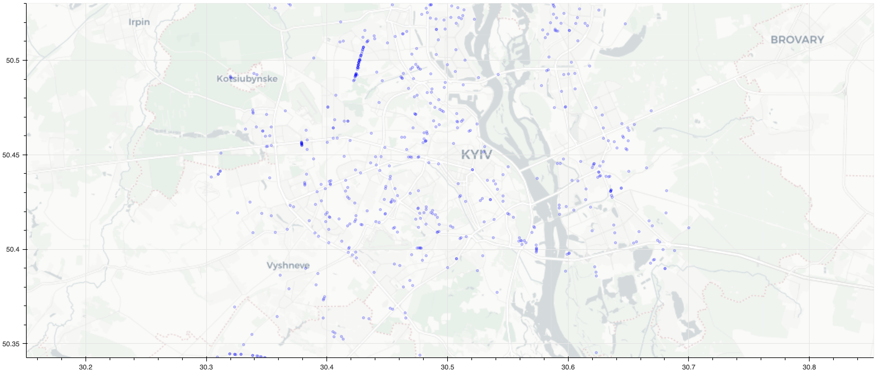
Check out the live sneak peek on visualizations.
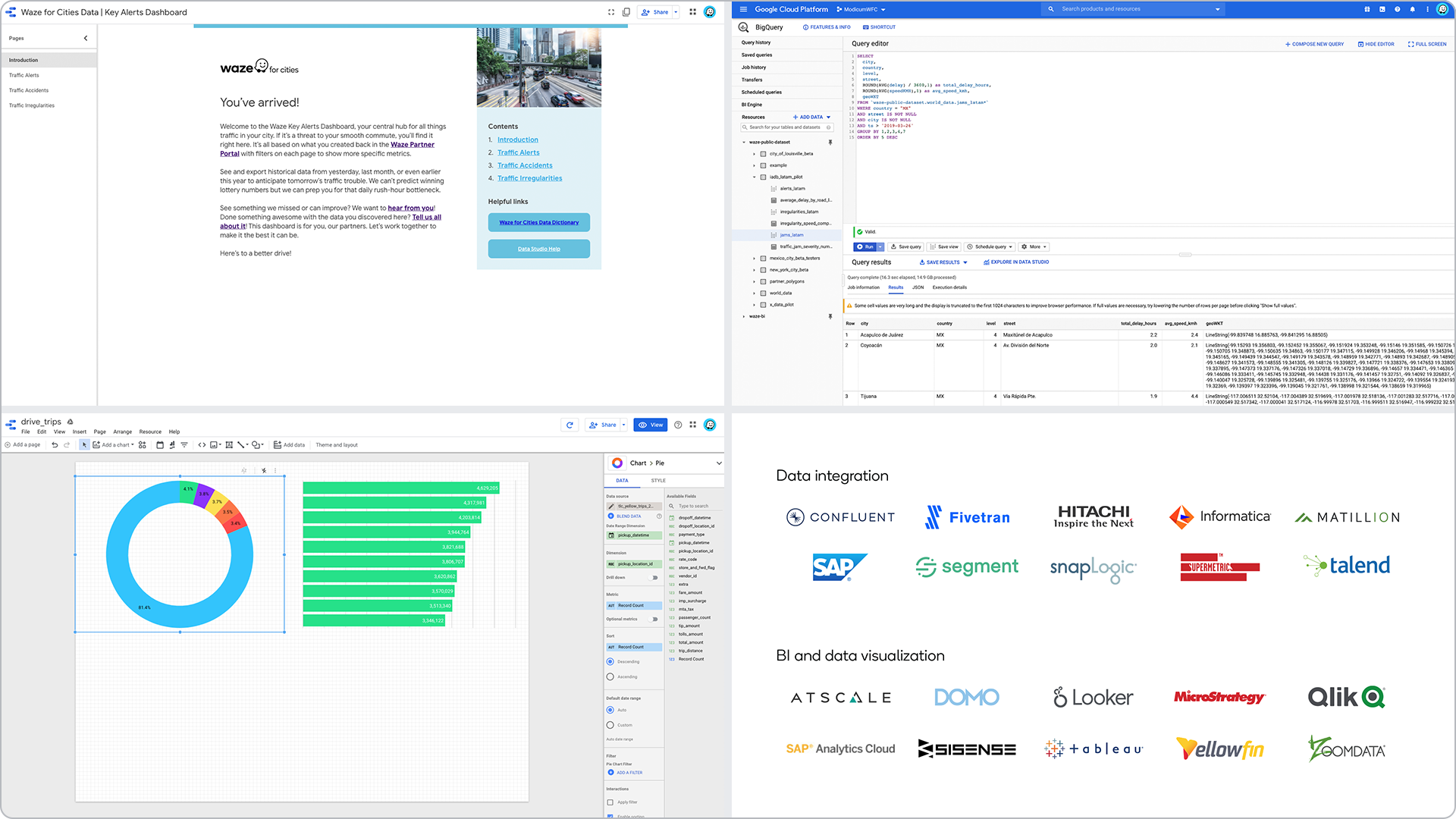
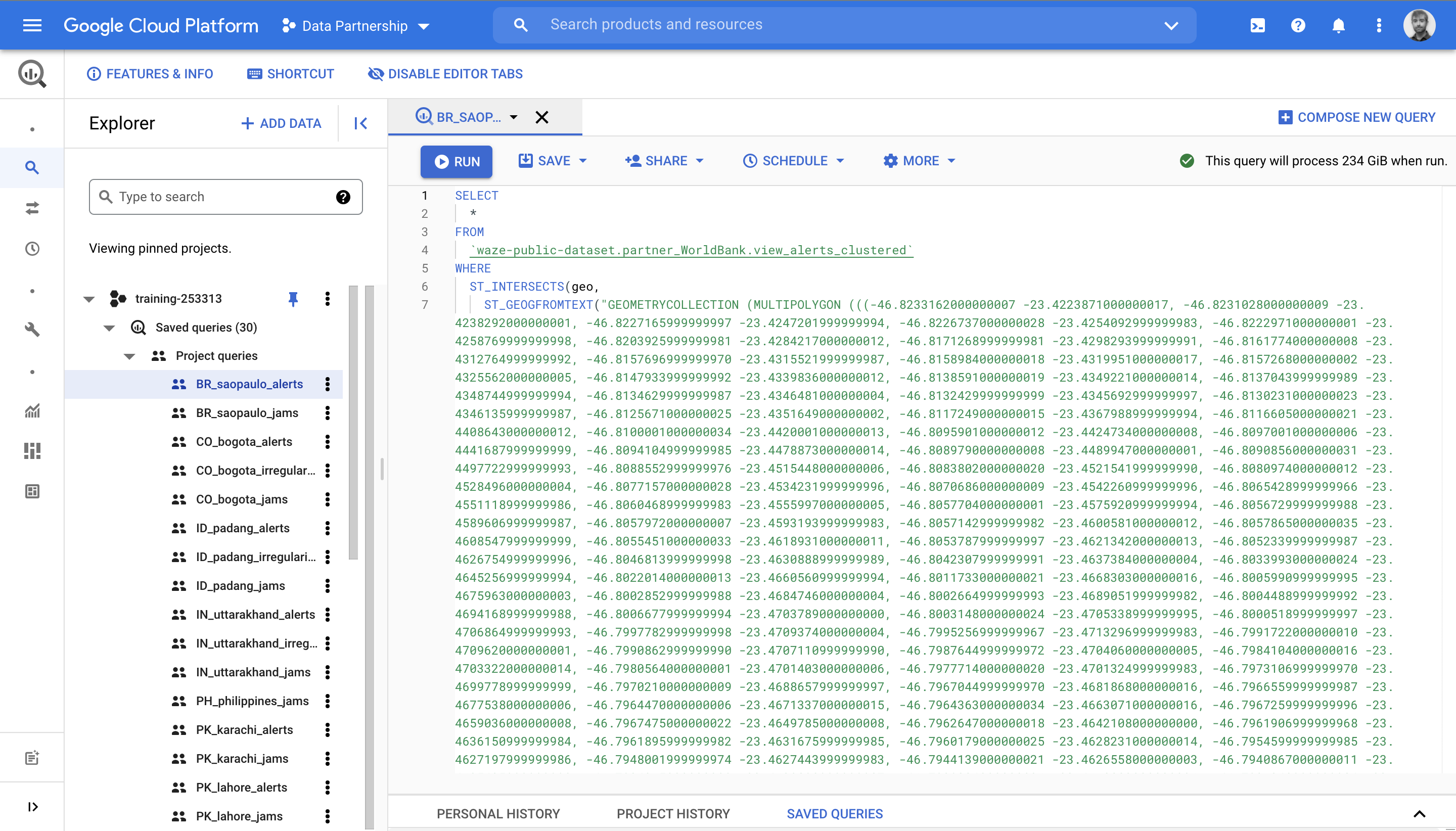
Exporting Waze Data from Google BigQuery
Starting in 2019, Waze has been providing access to a historical archive of traffic data on Google Cloud’s BigQuery. BigQuery is a fully-managed data tool that enables interactive SQL-like queries, while heavy lifting behind the curtains, and facilitating layering of Waze data with other datasets.
Using BigQuery’s geography functions, we select a time frame and Region of Interest (RoI) to be exported onto compressed and partitioned files.
Processing Waze Data with Dask
After exporting the data files (compressed CSVs), we have to prepare to visualize the large number of traffic alerts, in the order of millions. For that purpose, we leverage all power of Dask. Dask is a Python library build on top of NumPy and pandas. In addition to the familiar interface - for instance, reading multiple data files, decompressing and much more with a succint syntax and fast implementation - the library enables embarrassing parallelism in a very convenient and efficient way.
Let’s import the files into Dask DataFrame,
ddf = dd.read_csv(
        "s3://wbg-waze/bq/BR/alerts/2021/*.csv.gz",
        blocksize=None,
        compression="gzip",
)
Importantly, we make sure to cast proper data types, parsing the datetime into datetime64[ns]. Also, by using the dt accessor, we calculate additinal features: date (ignoring time), hour of the day and even the day of the week.
# Parse timestamp
ddf["ts"] = dd.to_datetime(ddf["ts"])

# Calculate feature columns
ddf["date"] = ddf["ts"].dt.date
ddf["hour"] = ddf["ts"].dt.hour
ddf["dayofweek"] = ddf["ts"].dt.dayofweek
On the other hand, the spatial component is a hurdle. The operation of determining whether a given point lies inside a boundary, or point-in-polygon, is computationally intensive.
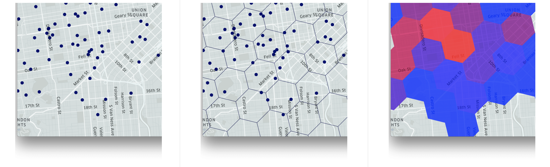
Here’s the trick. We calculate a spatial index!
A geospatial index divides areas of the Earth creating a grid system of determined grid cells. Then, the spatial information is translated into a hierarchical index, that can be easily joined relationally with other datasets.
In our example, we use H3: Hexagonal Hierarchical Spatial Index developed and open-sourced by Uber. See below an illustration of bucketing coordinates onto H3 hexagons.
And, finally, applying the h3.geo_to_h3 function to the Dask DataFrame, with zoom 10, or approximately 15000 m².
ddf["h3"] = ddf.apply(lambda x: h3.geo_to_h3(x["lat"], x["lon"], 10), axis=1)
Visualizing (Millions of) Waze Traffic Alerts
Now, with the geospatial index in hands, we are ready to reduce the order of millions to thousands without losing crucial insighs such as movements trends.
Aggregating on type, month and hour of the day
Aggregating on H3
Below the resulting map of more than 5 million Waze Traffic Alerts in just a few minutes.
To access Waze for Cities, see the documentation and submit a proposal through the Development Data Partnership Portal.
All examples and notebooks are available to the Partnership’s community on the GitHub repository (private). If you haven’t already and are staff of a participating organization, join us on GitHub!
Read more
https://www.waze.com/wazeforcitieshttps://docs.datapartnership.org/partners/waze/README.html
https://docs.google.com/document/d/1oBEtDp7OULpVVa_MOS-060S7pO_TZPlFO-4XmSKgfV8/view