Google, Apple, and Facebook: Understanding Mobility during Social Distancing with Private Sector Data
by Bruno Sánchez-Andrade Nuño , Gabriel Stefanini Vicente , Maksim PecherskiyMeta Google Transport
As countries around the world work to contain the spread and impact of COVID-19, the World Bank Group is moving quickly to provide fast, flexible responses to help developing countries strengthen their pandemic response and health care systems.
Part of this response is understanding the impacts of countries' lockdown policies. As governments strive to prevent the spread of COVID-19, they are also trying to prevent disproportionate socioeconomic impacts on vulnerable communities.
Understanding mobility across different communities, how it’s influenced by policies, and identifying early potential hot spots is crucial to governments as they monitor and lift lockdowns.
Note: All the code to replicate the analysis and plots, is available here.
Using private sector data to understand mobility
Private sector data can be a great asset in helping governments measure how their policies impact human movement within different communities.
For example, in areas with a higher median income and a more formal workforce, social distancing measures will likely have a higher degree of adherence.
However, areas with lower income and a more informal workforce will have a harder time following social distancing guidelines.
Several studies of United States counties support this hypothesis:
NYT
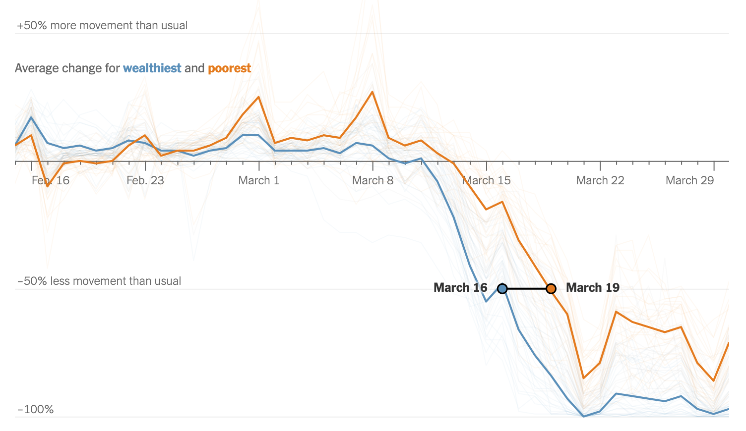
NYT with Cuebiq data: Census tract median of intra-day max extent of devices. 10% and 90% wealth percentiles. Wealthy counties essentially halted all movement and worked from home, while poorest counties trailed almost a week later, and with significant residual mobility as people could not afford to stay home.
Reuters
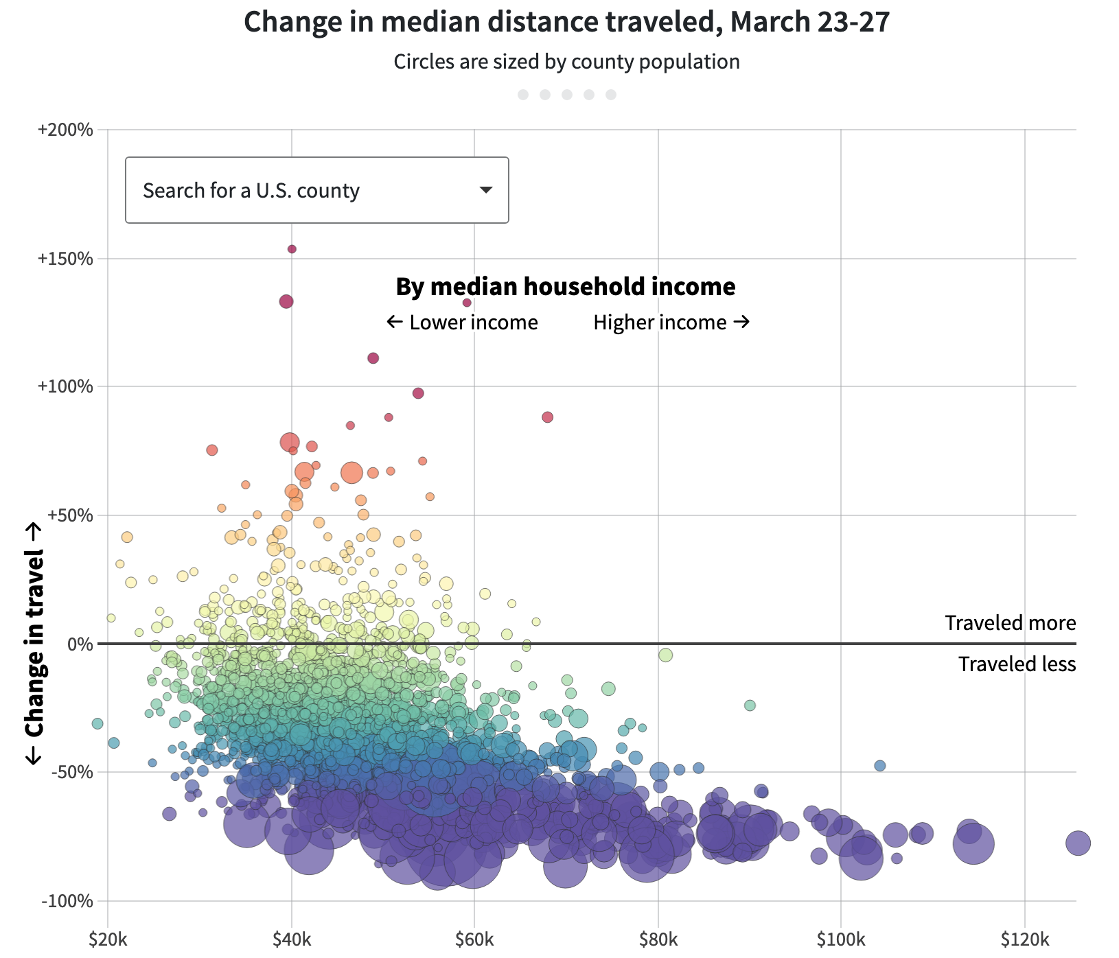 Reuters and MIT. Wealthier counties had less mobility than poorer ones.
Private sector publicly available data
To monitor mobility, there are several publicly available options from the private sector:
- Google’s publicly available aggregated mobility data
- Apple’s publicly available aggregated mobility data
In addition, through the World Bank’s Data Partnership the World Bank has access to several other datasets:
We will explore what we can do with each of the public datasets and some of the Data Partnership ones. However, not every dataset represents every population equally.
Some datasets may over-represent higher-income populations, while others may skew towards lower-income groups.
Exploring publicly available data
In early April 2020, the World Bank Group designated several countries to receive COVID-19 support. This list has since expanded.
We will focus on India, one of the countries receiving COVID-19 support. However, this will work for any country where data is available.
Let’s start with exploring public mobility data from Apple and Google.
Apple mobility data
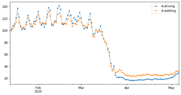
Apple’s data is activity based, recording when people were walking and when they were driving. We can clearly see a sharp decline in walking / data activity recorded by Apple devices at the end of March. People with a higher income tend to own Apple devices. We can see this trend on the NYT study above, and below we also explore this hypothesis for India using Google and Facebook data.
Lastly, we see that in early May, people are starting to drive and walk more.
Google mobility data
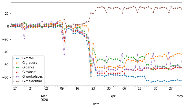
Google’s data is less about activity and more about location. How much time did people spend in a given location?
Note the changes after the end of March:
- An increase in time spent in residential locations (people staying at home)
- An overall decrease in Retail, Grocery, Parks, Transit and Workplaces.
However, once the initial drop happened, we still observe:
- Spikes in Workplaces. People across a wider diversity of incomes own Android phones. Based on this chart, there are still a good number of people going back to their workplaces.
- A drop in trips to retail locations, with a slight incrase in trips to grocery locations. From this, we can infer that people are decreasing retail spending and saving the money for groceries.
Comparing Apple and Google Data
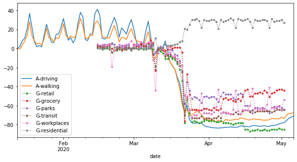
Comparing Apple’s activity data with Google location data, we make a few more observations:
- An increase in people staying in residential locations is [correctly] correlated with people walking and driving less.
- The slightly increasing driving and walking rates towards the beginning of May could potentially be related to a slight uptick of trips to the grocery store.
Adding in Facebook mobility data
We are going to start with Facebook’s new Movement Range data. This is not available to the general public, but it is available through the Data Partnership. Submit a project proposal to use it!
Facebook Movement Range data contains two types of data:
- Mobility Range: The degree of movement. How many map tiles were touched by users, relative to a baseline in the last months.
- Stationary Share: The percentage of users always on the same map tile, relative to a baseline last months.
Let’s explore first the relation between them on a scatter plot:
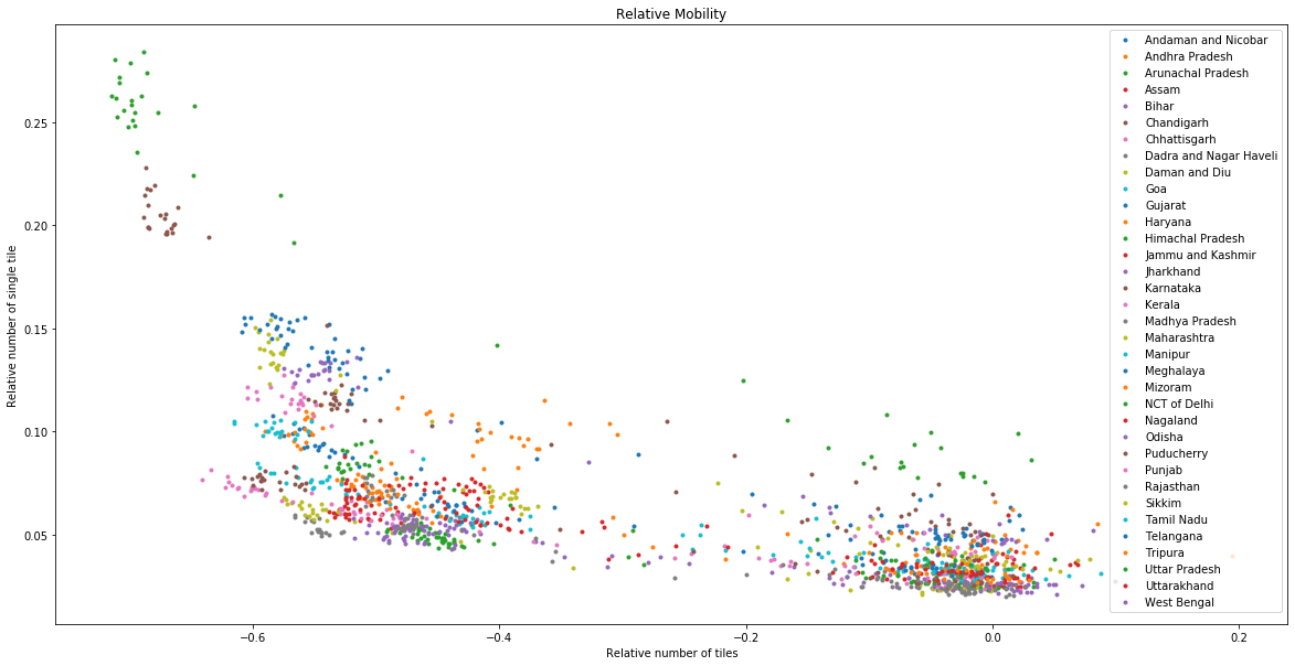
It seems clear, and logical, that there is a proportional relation: The more stationary a region is, the less movement range we see. A higher cluster around 0 (no relative change), means that in these regions, there is more variability of stationary populations.
We also see that some regions tend to be in the same space of the plot, especially the most compliant with the lockdown.
Mobility range
This data shows the average number of level 16 Bing tiles (0.6km by 0.6km) that a Facebook user (mobile app + location history) was present in during a 24 hour period compared to pre-crisis levels. This is called the Travel Range map.
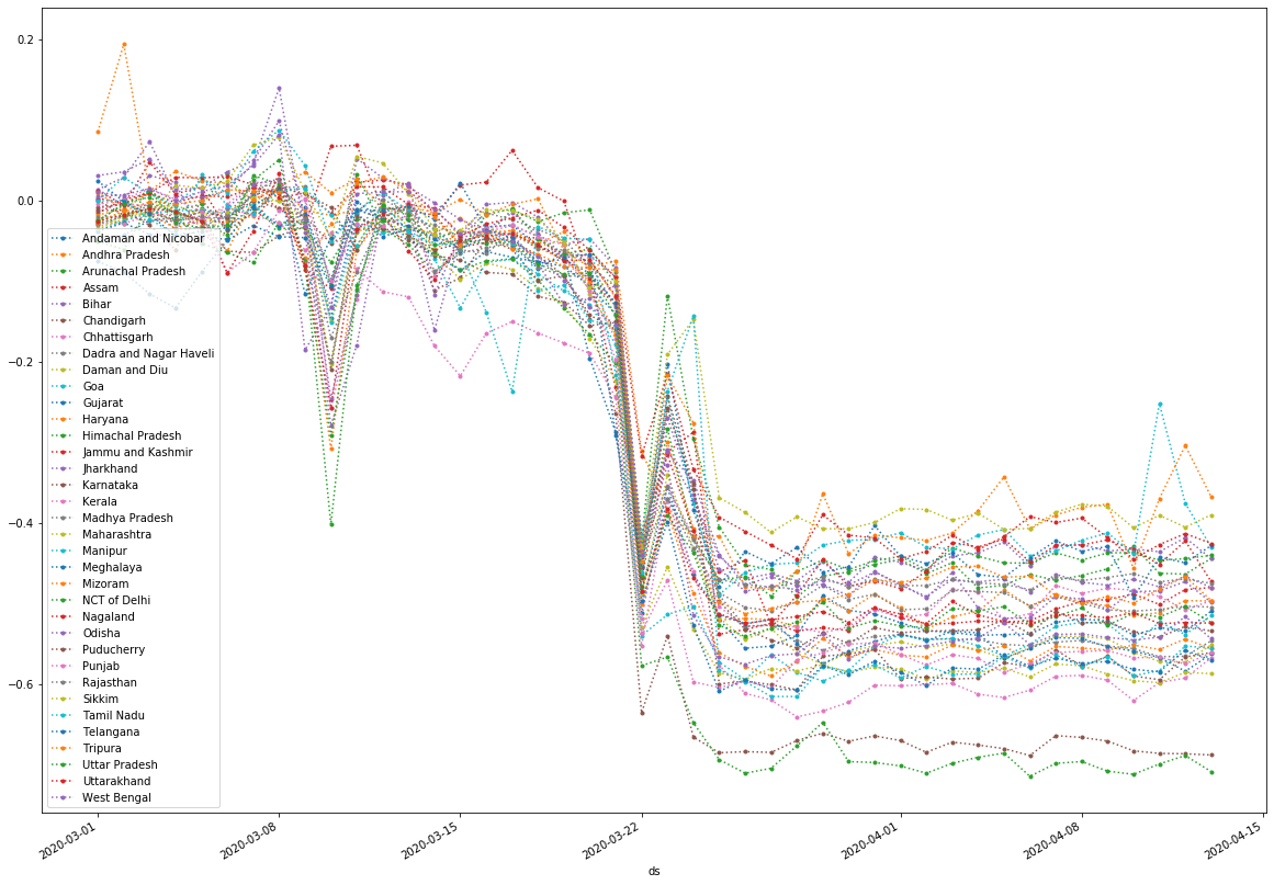
ALL regions see a significant decrease in range. The degree of change seems mostly constant, and some places twice than others.
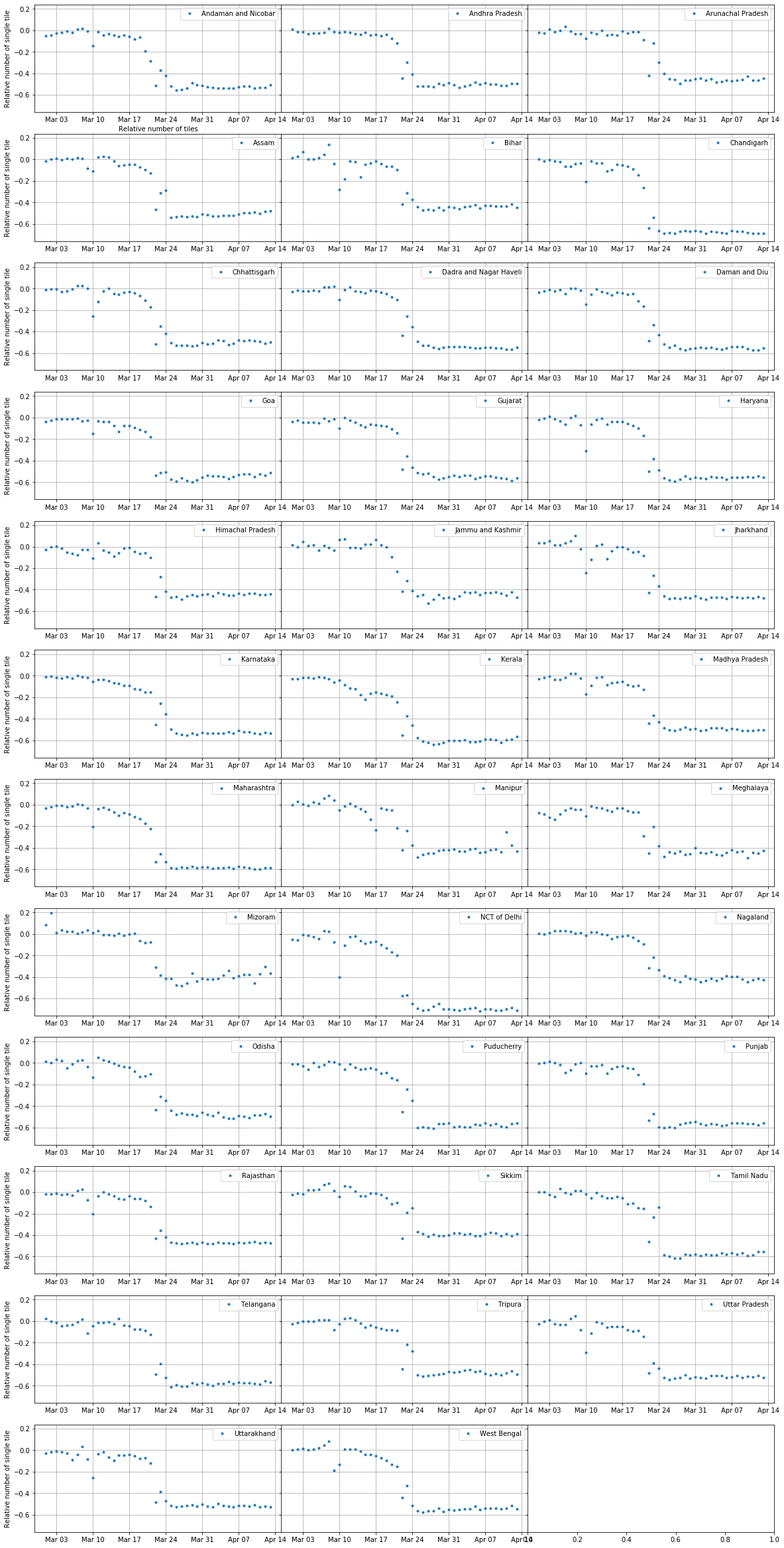
Stationary share
Percentage of Facebook users (mobile app + location history) that were present in only one such level 16 Bing tile in at least 3 different hours of the day.

We see that some regions see little change, while others see ~x15 increase. The capital “NCT of Delhi” is the region with the highest increase of stationay users, while Himachal Pradesh, a remote mountainous region varely saw any change.
Break up by Indian State
Comparing Apple, Google and Facebook data
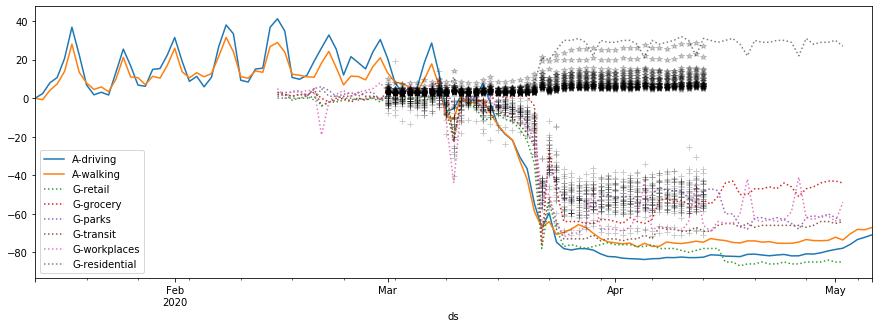
Apple mobility data (solid colored lines) tend to show among the strongest reduction of mobility, consistent with wealthier customers that can afford Apple products and can also work from home or restrict their mobility.
Google mobility data (dotted colored lines) breaks down mobility. We can see strongest reduction of mobility in retail and transit, comparable to Apple data. Groceries and workplaces remain with 40% mobility versus the baseline.
Facebook data (black crosses and stars) is broken down into states, and shows a significant range. This is expected as some states are largely rural and some urban, with different livelihoods and mobility patterns.
Review
In this post, you have learned how to work with Apple, Google, and Facebook Movement Range data.
We compared the three data sources, and discussed potential bias and its implications in mobility data.
If you are a Development Partner, and would like to use Data Partnership data, submit a project!
If you are a Data Provider and want to see your data be used for world-changing impact, sign up to work with the Data Partnership!