How to Find Population Movement Data for Your Country: The Mobile Location Data Inventory
by Rajee KanagavelMeta Veraset Unacast Cuebiq Outlogic
As the COVID-19 pandemic continues, so have measures to mitigate its spread. Physical distancing and movement restrictions – such as school and workplace closures, public event cancellations, stay-at-home orders, and international and domestic travel bans – vary considerably across countries.
Since movement restrictions themselves can have profoundly negative impacts on communities, it is essential for governments to understand which policies have the most and least effective impacts.
Anonymized “mobility data” – GPS data generated primarily from smartphones – may support efforts to limit movement restriction measures to those most needed, by painting a better picture of population frequency of movement, distance of movement relative to home, daily commuting patterns, inter-district flows, and social mixing.
A number of companies have generously made these data available, either publicly or through the Development Data Partnership, to support COVID-19 response programs.
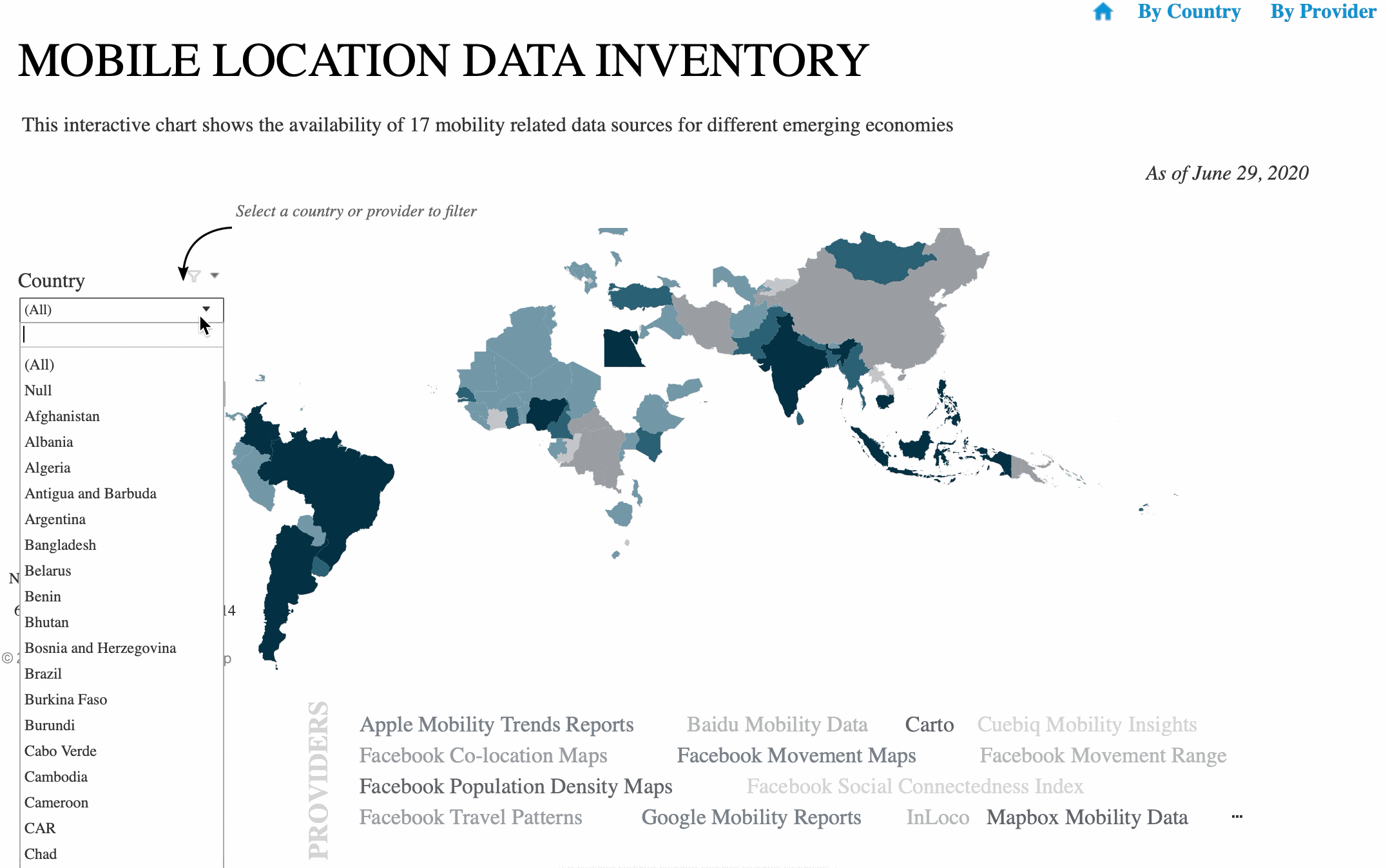
With so many new sources of information, it can be difficult to know where to start. To overcome this challenge, the Partnership, in collaboration with the World Bank’s Sustainable Development Data Lab and Health and Nutrition Program, created a Mobile Location Data Inventory, which shows the availability of 17 mobility-related datasets in 90 developing economies.
Click below to explore the data!
Visualization by Hellen Matarazzo, Data Scientist, Health Global Practice, The World Bank
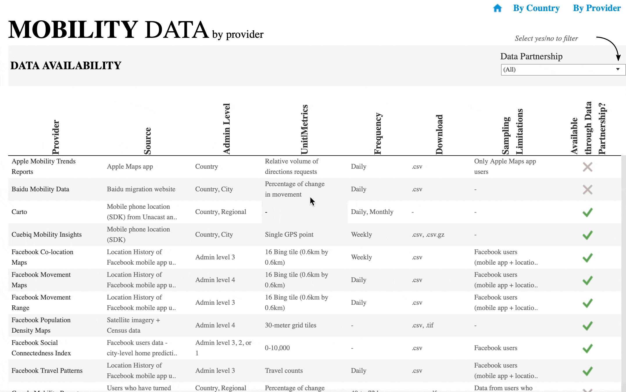
Apple and Google Mobility Reports
Google launched the Community COVID-19 Mobility Reports for 131 countries and regions following the outbreak. Apple released Mobility Trends Reports for 63 countries, regions, and cities. Both the datasets compare the change in mobility patterns to a baseline period. While Google insights focus on movements to and from specific business types (e.g., pharmacies, retail, parks, residential), Apple insights, which are based on Apple Maps direction requests, focus on movement by mode of transportation, such as pedestrian movement and public transport.
Facebook Movement Data
The Facebook Data for Good program has released four new datasets pertaining to mobility:
• Movement Range comprises two metrics: Change in Movement and Stay Put. The Change in Movement metric is an estimate of the number of the people who are “moving”, i.e., the average number of level 16 Bing tiles (0.6km by 0.6km) that a user was present in during an entire day versus a pre-pandemic baseline. The Stay Put metric estimates the opposite – the number of people who are staying home, i.e., percent of users that were present in only one level 16 Bing tile for at least 3 different hours on a given day. The COVID-19 Mobility Data Network provides a visualization of these publicly available maps for 14 countries.
• Colocation Maps present the probability of a co-location event between users from different admin level 3 regions, predicting the rate at which people in particular towns and cities where COVID-19 cases exist and interconnect with groups of people in other places.
• Travel Patterns examine international travel patterns of Facebook users (who have opted into sharing location data on their mobile app), comparing users’ movement across long distances between countries, especially via air and train travel. The counts of travel patterns are updated daily. These maps can be used to understand the economic impact and recovery of the travel and tourism industries.
• Social Connectedness Index looks at the relative probability of friendship ties between admin level 3 or 2 or 1 region, globally. This metric may be used as a covariate layer for predictive models for the spread of the disease.
Location Data and Mobility Insights
The Development Data Partnership has an agreement with four location intelligence companies – Unacast, Cuebiq,Veraset and X-Mode. They provide near real-time mobility data, which can be used to target and design measures in response to COVID-19. The unit of measurement is a single GPS point. Utilizing such datasets, CARTO provides location data analysis and visualization through their platform and spatial data repository.
Mapbox offers traffic and telemetry density data for mobility analysis. As telemetry data is collected only from moving devices, changes in movement can be observed at a larger scale, especially for map improvisation and traffic prediction.
You can use the visualization below to pick which dataset suits your needs based on the country you want to analyze. We are working hard to structure the data across providers in a similar way, so that you can use the same code to analyze data from all providers.
And…
Don’t see your data here and want to showcase the availability of your mobility data? Interested in learning how to work with these data? Write to us!